About
I am an associate professor at the University of Utah in the Kahlert School of Computing and SCI Institute. My research focuses on visualization challenges in complex exploratory analysis scenarios, such as those of active research teams. These challenges include representational and interactive scalability concerns for networks and timelines, integrating interactive visualizations in scripting workflows, and improving visualization methodologies. I have worked extensively in computing systems, developing methods of investigating behavior in high performance computing, distributed computing, data science, computer architecture, program analysis, optimization, and environmental planning. Supporting these goals, I also study how people conceptualize and communicate complex datasets. I was awarded an NSF CAREER grant (NSF 1844573) in 2019, a DOE Early Career Research Program grant in 2021, and a Presidential Early Career Award for Sciences and Engineers (PECASE) in 2025.
Prior to Utah, I was previously an assistant professor at the University of Arizona and a member of the Humans, Data, and Computers Lab (HDC).
Recent Projects & Themes
Node-to-Code: Scalable and Interactive Visualization for Performance Analysis
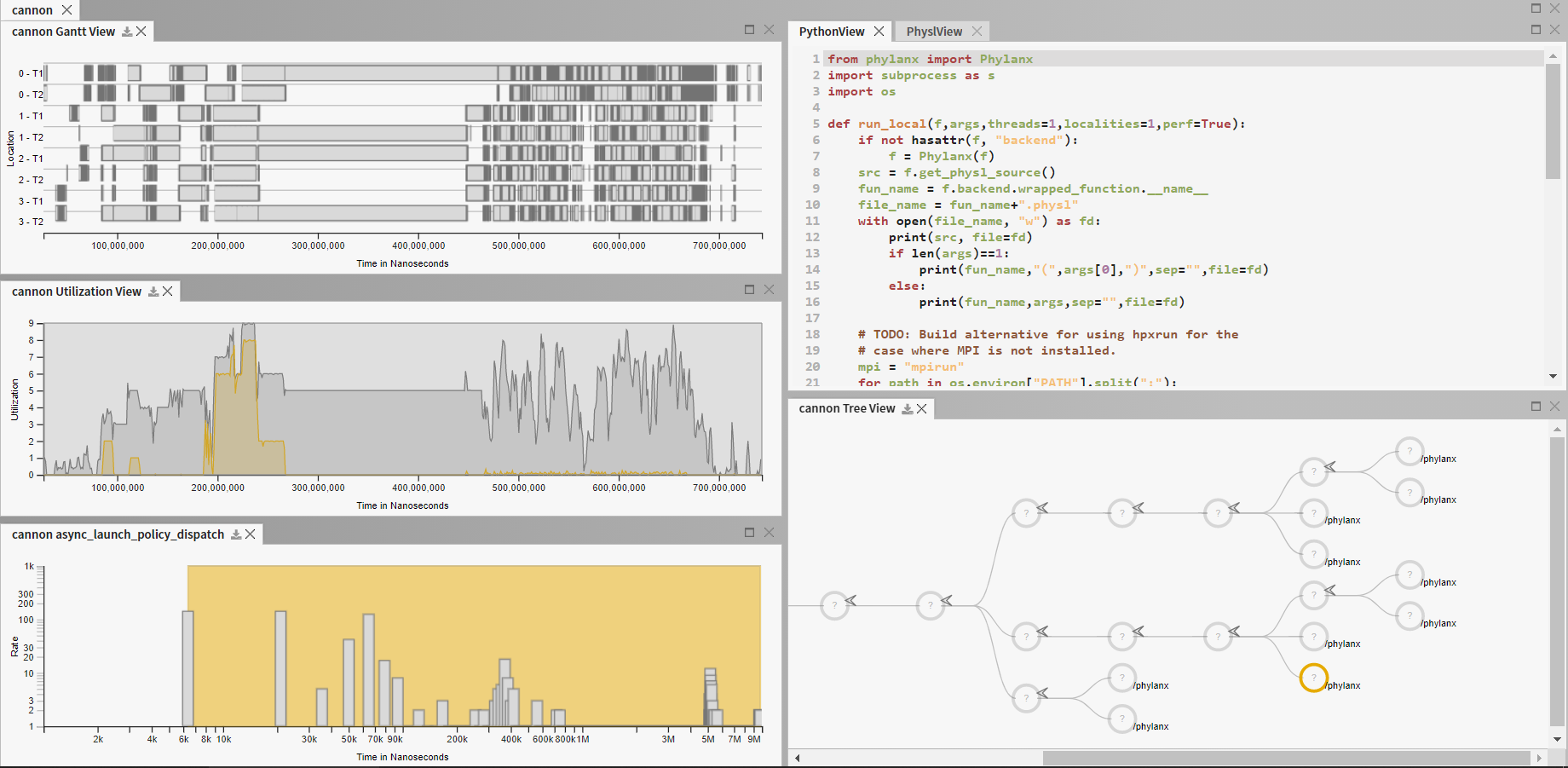
Performance analysis is often a highly exploratory endeavor. Visualization can help make sense of the vast quantities of data that can be collected from advanced parallel applications. However, both visual encodings and rendering latency are often hampered by the scale of data to be shown. The problem is exacerbated when multiple datasets are to be analyzed in tandem. Through work supported by the Department of Energy (DOE Early Career Research Award) and the Defense Technical Information Center, we are addressing these challenges to bring scalable, interactive, and interoperable visualizations for performance analysis. Our outcomes include Traveler, a visualization platform for execution traces, ESeMan, a data management system for fast drawing of Gantt charts and event timelines, and Guidepost, a visualization of job queue data. We also contributed to Thicket, a data science library for analyzing performance ensembles
ESeMan - LDAV 2025 | Guidepost on PyPI | Gantt Taxonomy - IEEE VIS 2024 | Scalable Gantt Designs - VISSOFT 2024 | Thicket - HPDC '23 | Traveler - IEEE VIS '22 (ArXiv) | Traveler on Github | Atria - InfoVis '19 (ArXiv)
As part of this effort, in collaboration with the Ste||ar group at LSU and the APEX project at University of Oregon, we are re-thinking (visual) performance analysis from the runtime, through the instrumentation, to the analysis and visual tools. Our work has thus previously served the Phylanx project, building a distributed array toolkit targetting several data science applications.
See also: HPX Website
Embedding Visualizations in Scripting Environments
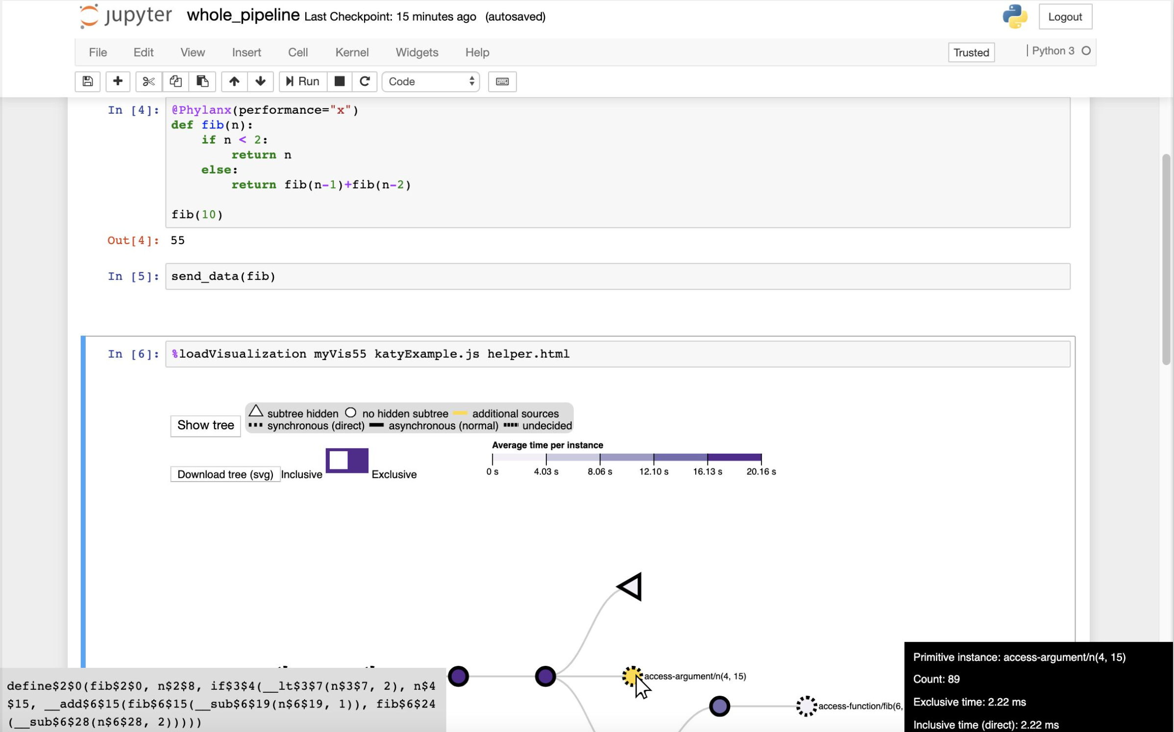
While some visual analyses are well-suited to stand-alone visualizaton systems, other visual analyses might be a relative small components of a larger endeavor. One example is a script-heavy analyses, such as those contained in Jupyter notebooks or those conducted at command line interfaces. We study needs in visualization for such workflows, how the environment may affect what we consider interaction, and how to design interactive visualizations that operate with these workflows.
By careful design of the passing of analysis tasks and data between visualizationa and scripting, we have developed methodologies for producing these visualizations, resulting in notebook-embedded tools supporting analyses of job scheduling data (Guidepost, with the National Renewable Energy Laboratory), performance profiles (in Hatchet with LLNL and the University of Maryland), and asynchronous multi-task runtimes (Atria with LSU and University of Oregon). We produced a library (Roundtrip), for enabling these interactions in notebooks, and graphterm, an ASCII-based interactive network visualizer for use in command line workflows.
This research has been supported by the Department of Energy (DOE Early Career Research Award), the National Renewable Energy Laboratory, and the Defense Technical Information Center.
Guidepost on PyPI | Design Methodology - TVCG '24 | Roundtrip library on Github | Hatchet visualization on Github | Atria - InfoVis '19 (ArXiv) | graphterm on Github | graphterm - TVCG '19
Improving Node-Link Diagrams for Network Visualizations in Computing Systems
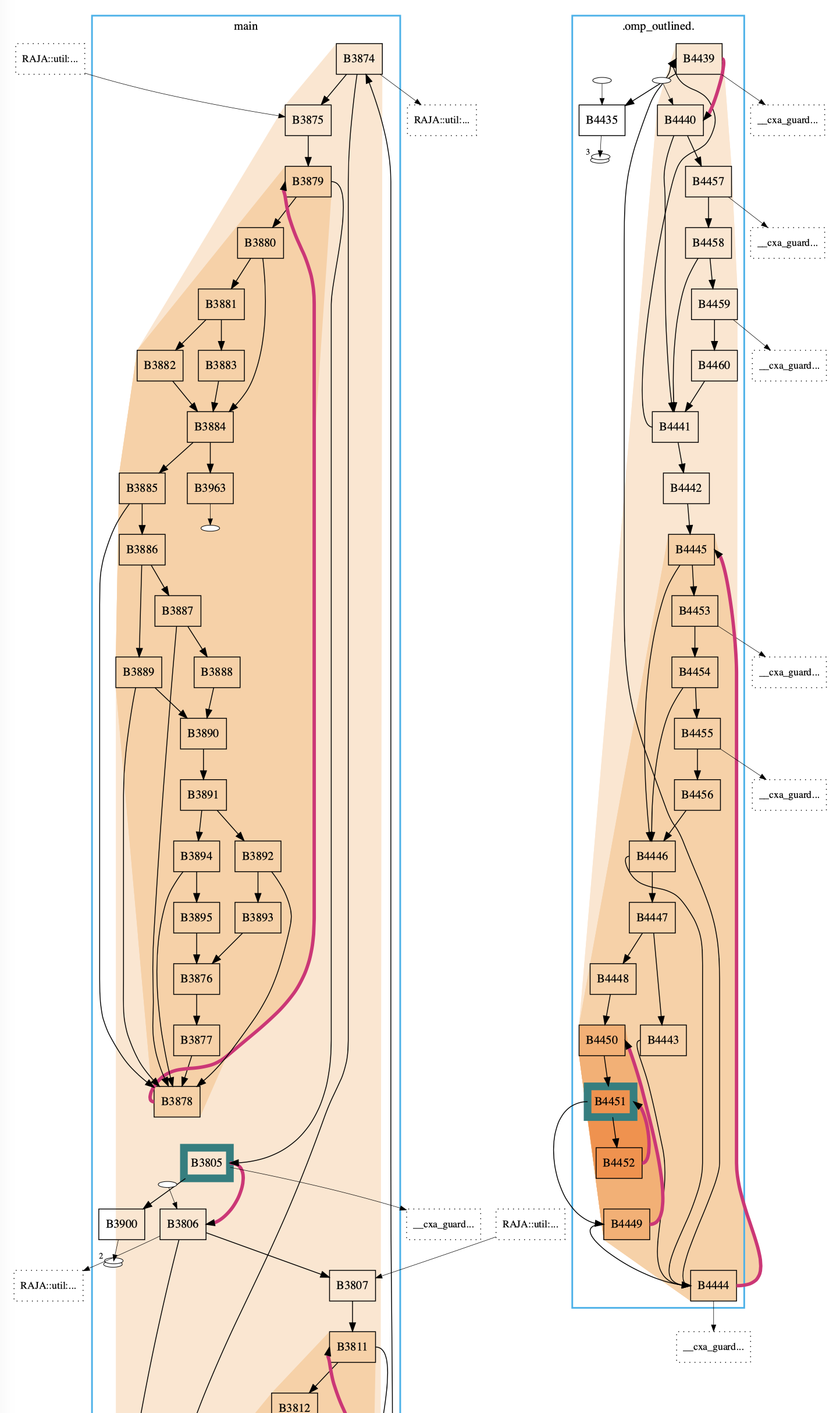
Graphs are prevalent in computing systems. Control flow graphs describe paths through programs. Call graphs describe relations among functions. Task graphs describe ordering of work units. Dependency graphs describe relationships among libraries. Thus, people working in computing often have need to examine these graphs. However, general graph drawing approaches often cannot scale to the needs of these workers or when they do, provide a drawing that is difficult to interpret. We are developing approaches that identify and incorporate drawing conventions and layout algorithms to address these challenges.
We have developed new layouts to support different forms of network visualization as well as new domain-specific interfaces for specifying them, thereby enabling people to access visualizations suiting their needs.
This work has been supported by the National Science Foundation through the Dependencies Visualization project (Grant No. NSF III-1656958) and the Systems Graph Visualization project (Grant No. NSF III-1844573) and by Lawrence Livermore National Laboratory through sub-contracts LLNS B639881 and B630670.
General Graph Drawing:
Overview + Detail Layout - IEEE VIS 2024 |
Alternate Data Abstractions - InfoVis 2020 |
Alternate Data Abstractions Survey Data |
Stress-Plus-X - Graph Drawing 2019 |
Stress-Plus-X library
CFGs:
DisViz - TVCG '26 |
CFGConf - VISSOFT 2022 |
CFGConf on Github |
CCNav - VAST 2020 |
CFGExplorer - EuroVis 2018 |
CFGExplorer on Github
Graphs in ASCII:
graphterm - TVCG 2019 |
Survey of Graph Tools used by Github Projects
NSF Project Websites:
Systems Graph Visualization |
Visualizing Dependencies
Look Over Here - Gestures and Visualization
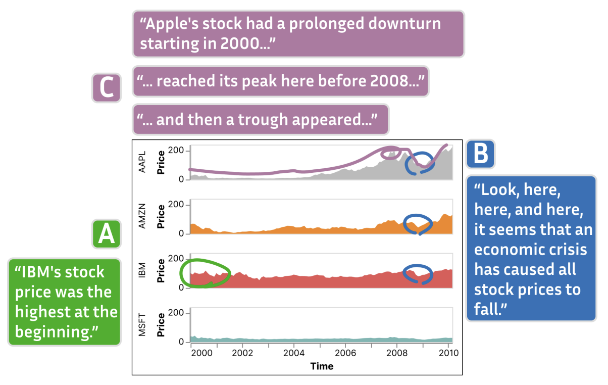
Pointing gestures are frequent when people talk about and present data visualizations. We study how gestures around visualizations occur in online meetings. Through a series of studies, we develop a preliminary taxonomy of online gestures and their meanings. We also develop a system that captures these gestures and associates them with verbal utterances to create annotated and interactive transcripts of their meetings that replay the gestures on the visualizations. Our tool offers and quick and lightweight way to review these data discussions without needing to replay video.
Associating Gestures and Utterances in Online Meetings - IEEE VIS 2024
Human-Centered Computer Architecture - Visual Interfaces for Chip Research
Research in computer architecture drives the development of new and more powerful computing hardware. New hardware designs must be simulated, generating vast amount of data that can be difficult to analyze. Furthermore, the simulations themselves can be a bottleneck or barrier to research as they require strong technical skills to run and manage. Funded by the National Science Foundation, this project considers interfaces and visualizations to address the needs of computer architects.
Interfaces for Monitoring Chip Simulations - MICRO-57 | Network-on-Chip Visualizations - TVCG 2024
How People Think About Data for Visualization and Interface Design
A key part in any visualization project is understanding the data to be visualized. There are several factors regarding data, including the format, ranges, meaning, and form. We seek to understand how people conceptuatlize their data and use this knowledge to understand how we, as visualization designers and researchers, can improve our processes of data and workflow discovery and ultimately design better visualizations and interfaces for people. We conducted a study to delve deeper into questions about how people think and cast their data. We identify and define latent data abstractions—data abstractions which are useful and meaningful, but not yet fully gestated. We report on our observations and produce guidance for further data discovery.
Data Abstraction Elephants - ACM CHI 2023 | Latent Data Abstractions - InfoVis 2020 | Latent Data Abstractions Survey Data
Cinematic Scientific Data Visualization - Public Communication
Cinematic Scientific Data Visualization blends scientific data visualization with cinematic techniques such as camera, direction, and lighting to produce visualizations that are both illustrative and appealing. We study the effectiveness and reach of these visualization as well as techniques to improve both their creation and reception.
Past Projects & Themes
Integrating Citizen Science, Environmental, and Socio-Economic Data
Health is affected by myriad factors including one's environment and circumstances. As part of the UArizona Superfund Research Center, we are gathering data from a wide variety of sources, from government agencies to citizen scientists, to better understand how communities can build resiliencies to environmental hazards. We are integrating this dataset so it is Findable, Accessible, Interoperable, and Reusable (FAIR) while protecting sensitive data contributed by individuals. The data is being made available through a publically accessible site. We are building a visual analytics system to allow stakeholders to explore and download facets of the data.
Understanding the Space of Infographics
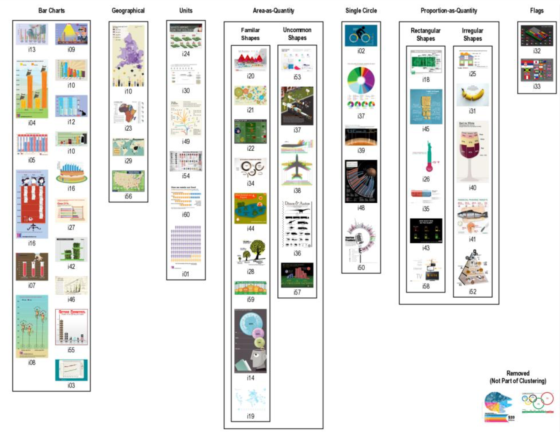
Infographics are a widely-viewed visualization medium, used to communicate and engage the general public with data on a wide breadth of subjects. To better understand the space of infographics, we derive a classification using the groupings of people from that general public on a corpus of infographics. We found people grouped them by their primary data encoding over other criteria such as aesthetics and complexity and that there was a prevalence in area-as-quantity and proprotion-as-quantity, not typically associated with a common chart type.
Classification of Infographics - Diagram 2018
Control Flow Graphs and Dynamic Traces, with Science Up To Par (s2par): Language Agnostic Optimization of Scientific Data Analysis Codes

Parallelizing scientific and data analysis applications can require significant engineering effort. For in-development applications and frequently altered data analysis scripts especially, the time commitment is a significant barrier to the gains of parallelization. Science Up To Par applies dynamic binary analysis and specialization to automatically parallelize scientific applications in a language-independent manner. This project is in collaboration with Michelle Strout and Saumya Debray. In support of these efforts, as part of the NSF-funded Dependencies Visualization project, we are developing visual tools for analyzing control flow graphs and dynamically collected instruction traces. This material is based upon work supported by the National Science Foundation under Grant No. NSF III-1656958.
Visualizing Dependencies Project Website
Ravel - Parallel Execution Trace Visualization
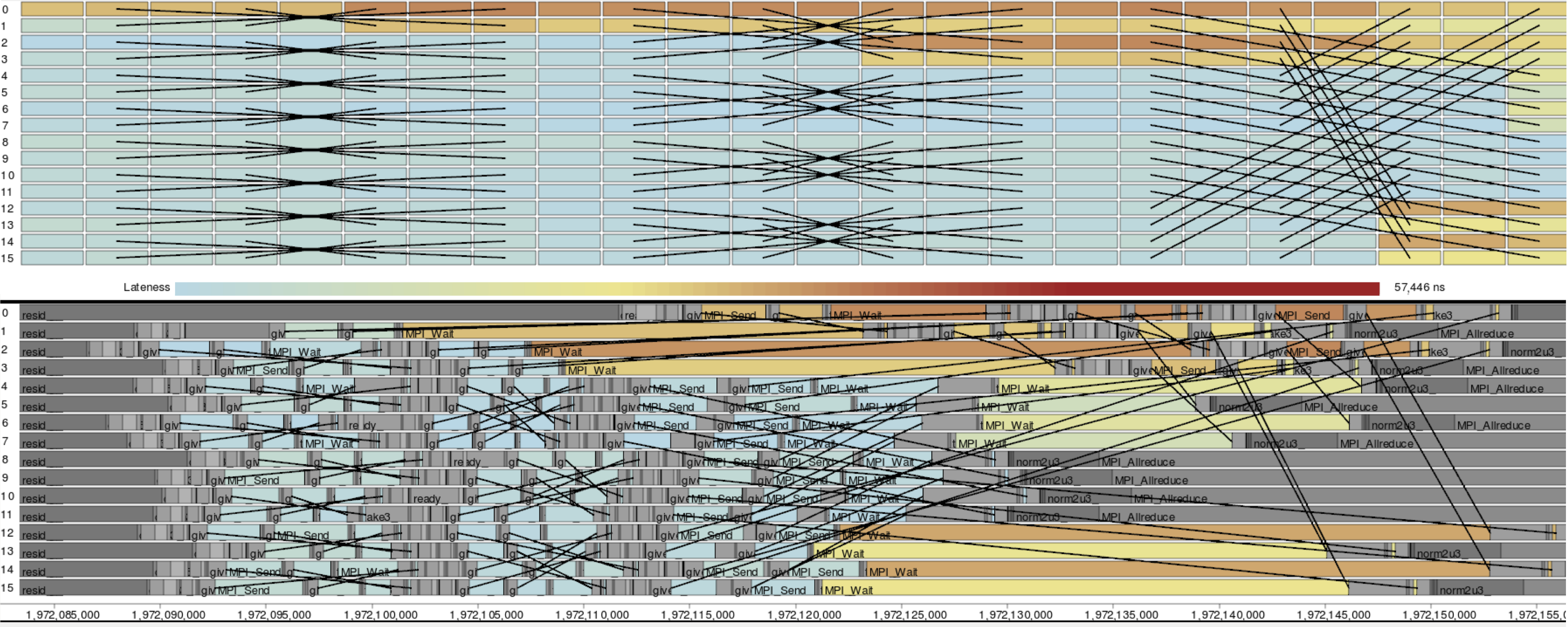
Traces are records of actions occurring during a program's execution, such as function calls and communication. They are a powerful tool in performance analysis as they can contain the detailed data necessary to reconstruct exactly what occurred. However, understanding traces is difficult due to the huge number of actions and relationships among all processes. As such, timeline visualizations are frequently employed to explore the data. Unfortunately, timelines become cluttered and difficult to interpret for even moderate numbers of processes.
Ravel focuses on increasing the scalability and utility of trace visualizations via a structure-centric approach which approximates the developers' intended organization of trace events. Visualizing this logical structure untangles communication patterns, allows aggregation in process space, and provides users with much needed context. Analyses using Ravel have led to the discovery and understanding of performance issues in several massively parallel applications.
Visualization - InfoVis '14 | Ravel on github
Logical structure (MPI) - TPDS 2016 | Logical structure (Charm++) - SC15
Boxfish - Linking Domains and Network Visualization
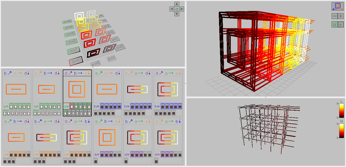
Numerous factors, such as the placement of specific tasks in the hardware, their timing data, and functions of multiple tasks, affect the performance of parallel applications. Boxfish was developed to support visualizing these relationships. Boxfish manages complex filtering of data and linking of visualizations, even when these relationships are not direct or bijective. Several network visualization modules have been developed for Boxfish, including multiple views of 3D torus/mesh networks and a 5D torus/mesh. Analysis using these visualizations in Boxfish has aided in understanding the interactions of task assignment and the underlying system network for both individual applications and the interactions of several applications on a shared system.
Boxfish on github | Boxfish poster abstract - SC12
Visualization Modules
3D torus visualization - InfoVis '12 | 5D torus visualization - VPA '14
Applications
Task mapping - SC12 | Job placement - SC13 | Task mapping, 5D torus - HiPC '14
Scalable Communication Visualization

Traditional statistical plots and graphics for performance analysis may prove ineffective because they do not show data in the most meaningful context. For one library, this meant mapping performance data to its communication overlay. The communication graph grows as the application uses increasing numbers of parallel processes. This requires a visualization that aggregates intelligently to scale with that parallism while still depicting behaviors of interest.